Visualizing Historical Stock Data: Unveiling Insights with Candlestick Charts and Correlations Analysis
https://github.com/whoisndu/stock-visualization-candlestick-correlation

Introduction
In the world of finance, understanding the historical performance and relationships between stocks is essential for investors seeking to make informed decisions. Visualizing stock data through candlestick charts and analyzing correlations can provide valuable insights into market trends, diversification opportunities, and risk assessment. This article will explore how candlestick charts and correlation analysis can empower investors with a deeper understanding of historical stock data.
Candlestick Charts: Illuminating Price Movements
Candlestick charts have long been a popular tool for visualizing price movements in the financial industry. These charts concisely represent a stock's open, high, low, and closing prices within a given time frame. The shape and color of the candlestick patterns offer valuable insights into the market sentiment and potential trading patterns. By incorporating candlestick charts, investors can identify trends, reversals, and potential entry or exit points in the market.
To illustrate this, let's consider an example where we select multiple stock symbols and plot their historical price data using candlestick charts.
By leveraging the yfinance package and the powerful Plotly library, we can create interactive candlestick charts for each stock symbol.
This enables investors to visualize the price movements over time and better understand the market dynamics.
Correlation Analysis: Unveiling Relationships Between Stocks
Beyond visualizing individual stock performance, analyzing the correlations between different stocks can unlock deeper insights. Correlation analysis measures the statistical relationship between two or more stocks, revealing how they move in relation to each other. By understanding the correlation between stocks, investors can assess diversification potential, identify risk levels, and uncover potential investment opportunities.
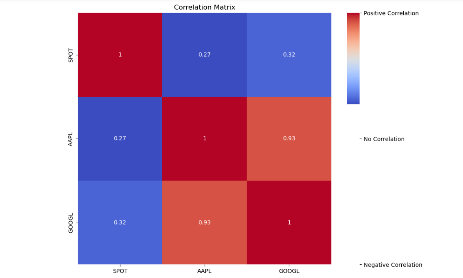
To calculate correlations between stocks, we can retrieve their historical price data and utilize the pandas library. By constructing a correlation matrix, we can quantify the relationships between the selected stocks for a time period.
This matrix provides a numerical representation of the correlation coefficients ranging from -1 to 1.
A correlation coefficient of 1 indicates a perfect positive correlation
-1 represents a perfect negative correlation, and 0 indicates no correlation.
Analyzing the correlation matrix can help investors make informed decisions when constructing portfolios, managing risk, and identifying sector rotations.
Let us create a candle chart and perform a correlation analysis
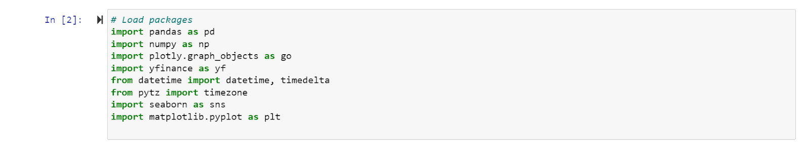
Step 1: Download and Load Packages
To begin, we need to import the necessary packages:
pandas: Enables data manipulation and analysis.
numpy: Supports numerical operations.
plotly.graph_objects: Facilitates interactive candlestick chart creation.
yfinance: Allows retrieval of market data from the Yahoo! Finance API.
datetime: Handles date and time operations.
pytz: Manages timezones.
seaborn: Provides tools for creating informative visualizations.
matplotlib.pyplot: Enables plotting the correlation heatmap.
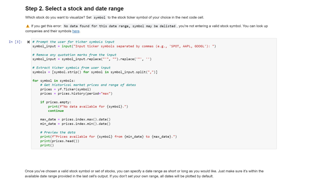
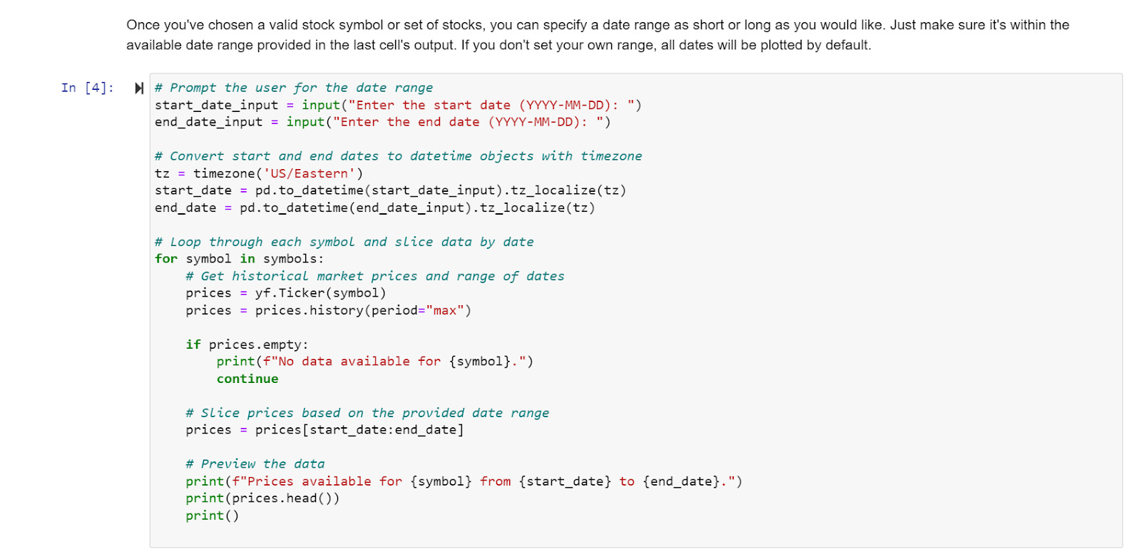
Step 2: Select Tickers and Date Range
We prompt the user to input the ticker symbols of the stocks they wish to visualize, separated by commas (e.g., 'SPOT, AAPL, GOOGL'). Additionally, we ask for the start and end dates of the desired historical data. These inputs ensure a personalized and relevant analysis.
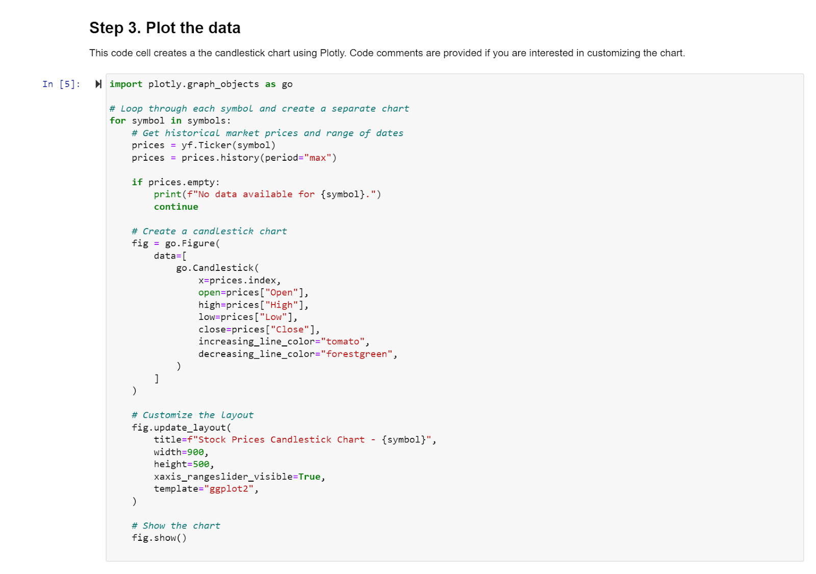
Step 3: Plot Candlestick Charts
We loop through each ticker symbol and retrieve the historical market prices for the specified date range using the yfinance package. Using plotly.graph_objects, we create interactive candlestick charts that display the opening, closing, highest, and lowest prices for each trading day. Users can zoom in, hover over the candlesticks, and gain insights into stock price patterns.
Step 4: Calculate and Plot the Correlation Heatmap
To understand the relationships between the selected stocks, we calculate the correlation matrix. By utilizing the pandas DataFrame and the corr() function, we derive the correlation coefficients between the closing prices of the stocks. To visualize this matrix, we employ seaborn and matplotlib.pyplot to generate a correlation heatmap. The heatmap uses colors to represent the strength of correlations, with darker shades indicating stronger positive or negative correlations. This graphical representation allows for quick identification of stock groups with similar or divergent price movements.
Importance of Deriving Correlations Between Stocks
Deriving correlations between stocks holds significant importance for several reasons:
Diversification: Correlation analysis helps investors understand the diversification potential of their portfolios. By incorporating stocks with low or negative correlations, they can potentially reduce overall portfolio risk and enhance returns.
Risk Assessment: Correlations provide information about how stocks move in relation to one another. By identifying stocks with low correlations, investors can mitigate the impact of individual stock movements and manage portfolio risk effectively.
Sector and Market Analysis: Correlations help investors analyze the relationships between different sectors or the broader market. Understanding these interdependencies aids in making informed investment decisions and adjusting portfolio allocations accordingly.
Hedging Strategies: Correlations can be leveraged to develop hedging strategies. By identifying stocks with high positive correlations, investors can use one stock to hedge against potential losses in another, protecting their portfolio value during market downturns.
Portfolio Optimization: Correlations play a crucial role in portfolio optimization techniques. By incorporating correlations, investors can construct portfolios that aim to maximize returns while minimizing risk. Efficient portfolio allocation based on correlations can lead to improved risk-adjusted returns and better portfolio performance.
Conclusion
Visualizing historical stock data through candlestick charts and analyzing correlations between stocks empower investors with valuable insights into market trends, risk assessment, diversification potential, and portfolio optimization. By incorporating these techniques, investors can make informed decisions, enhance portfolio performance, and navigate the dynamic landscape of financial markets with greater confidence. So, whether you are a novice investor or a seasoned trader, leveraging the power of candlestick charts and correlation analysis can significantly impact your investment journey.